
EarthScope Consortium
Brand Identity
Year 2021
Type Agency
Role DESIGNER
EarthScope Consortium is an open-source geophysics research organization, recently formed by the merging of IRIS and UNAVCO, two seismology and geodesy research organizations. My agency, PartnersCreative, was asked to create a brand identity and graphic standards manual to represent the work done by the new conglomerate, while also hearkening back to each individual organization’s heritage.

Logo
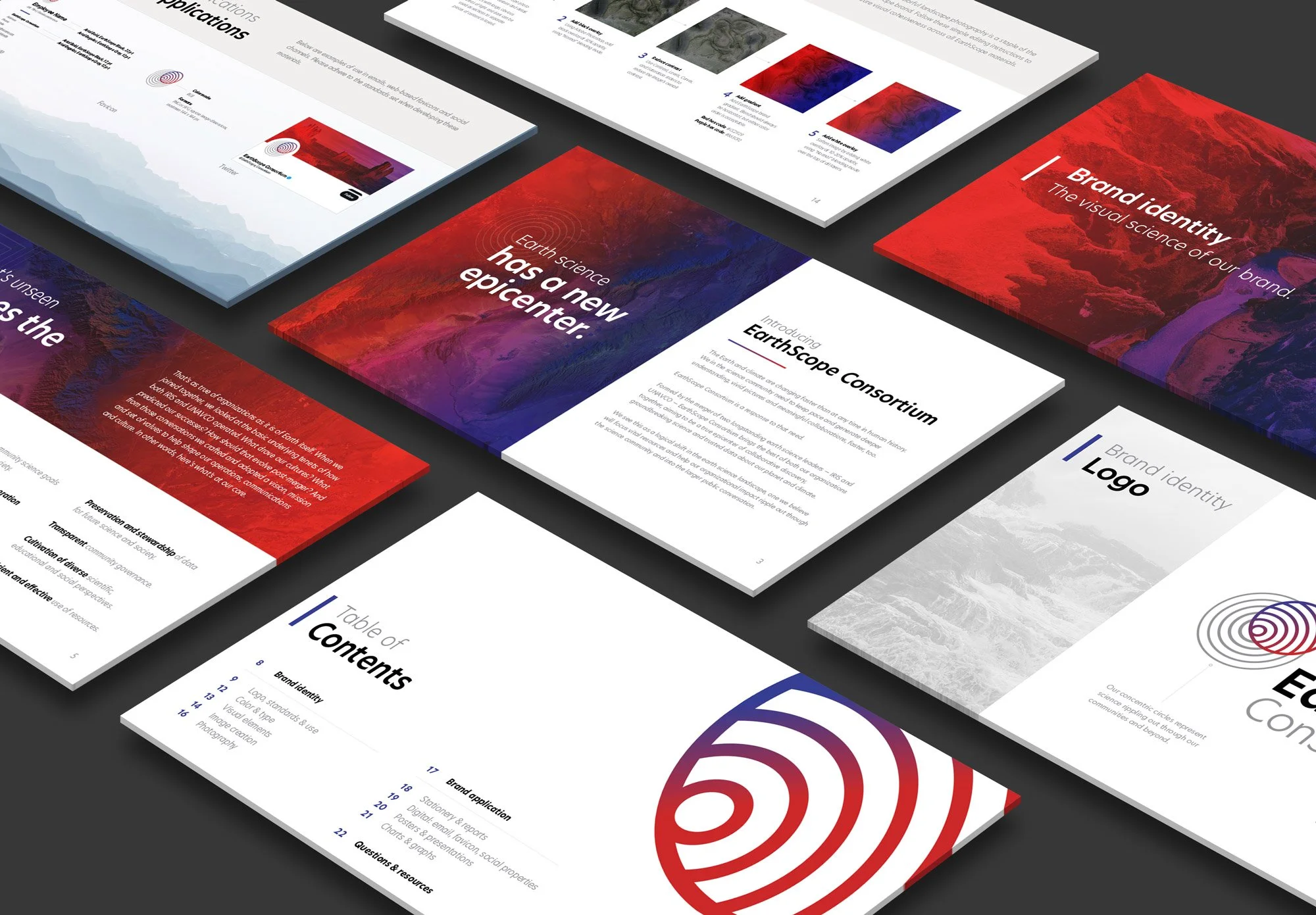
The EarthScope logo is a direct representation of the notion of geophysicists “seeing the unseen”; whether we are aware of it or not, the study of seismology and geodesy constantly influences our everyday environment, modern engineering, city planning, and overall safety. The study of these sciences - represented by the gray concentric circles - is therefore enhanced and highlighted by the work of EarthScope - represented by the colored and magnified “scope” placed over the top of gray lines.

Graphic Standards
Following approval of the logo, we built the brand further by creating a graphic standards manual. As a research organization that observes, preserved, and celebrates nature, the main pillar of the brand’s visual identity became the use of the red-to-purple gradient over the top of majestic landscape photos. We also spelled out logo use cases and orientation alternatives, provided the brand’s official color palette and typefaces, and created guidelines for photo selection, chart and graph visuals, and examples of future print and digital collateral.