Layer One Studio
Product Advertising
Year 2020
Type Freelance
Role Creative & Art Director, Photography, Production, Copywriter, Designer
Layer One Studio is a design studio started by my childhood friend that uses 3D printing and laser cutting technology to create jewelry made of sustainable and biodegradable materials.
The jewelry is made predominantly of recycled corn biomass, and all items are shipped using eco-friendly packaging and bubble wrap. The backing card for each product is also made of seed paper that can be planted in soil and watered to grow wildflowers indoors or outdoors.
My friend hired me as a freelancer to build the entire Layer One identity and apply it across a number of different print and digital formats, with the goal to drive product sales and build overall awareness for the brand. While the business is now defunct, all of the following design work, photography, copywriting, and production work was done by myself.
Branding
The symbolism in the Layer One identity is an unspoken nod to the art of 3D printing, as well as the bright and cheerful colors found on the brand’s jewelry. Not only are the colored vertical “layers” a reference to the brand name, they are also visually reminiscent of the way 3D printers extrude filament in thin layers as they print. The mark, when placed alongside the type, creates a subtle “1” in the whitespace using an implied line. The typeface is confident, modern, and engineered.
Layer One also has three alternatives beyond the primary logo. One simplified version drops the “Jewelry” subhead to ensure legibility at small sizes, and would represent the overarching brand if Layer One were to ever move to printing other products. Another standalone version of the mark loses the typography entirely and completes the aforementioned implied line to fully resolve the “1.” A third simplified rectangular version easily occupies horizontal spaces, and has a small notch in the upper-right corner that is a visual representation of a 3D printing nozzle seemingly “printing” the type inside the rectangle.
Website
The Layer One website is a visual extension of the branding and the products themselves; clean typefaces, bright colors against whitespace, photographs of the outdoors, and sharp geometry. From the moment a potential shopper arrived at the site, the goal was to immediately tell the story of the brand’s unique combination of 3D printing, laser cutting, sustainability, and fashion.
Built entirely by myself, the site was fully responsive at all sizes, and featured a complete online store, CSS animated elements, parallax backgrounds, product photo carousels, live looks at brand social feeds, and forms for visitors to submit proposals for custom jobs.
Product Photography
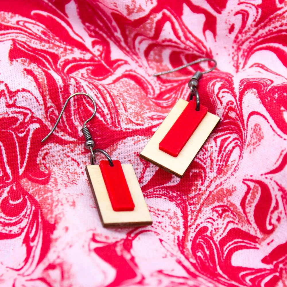
Layer One’s product photography is predicated on using eye-catching, complimentary colors and bold geometric patterns without sacrificing the beautiful textural detail of the 3D printed materials and laser cut wood.
Lifestyle Photography
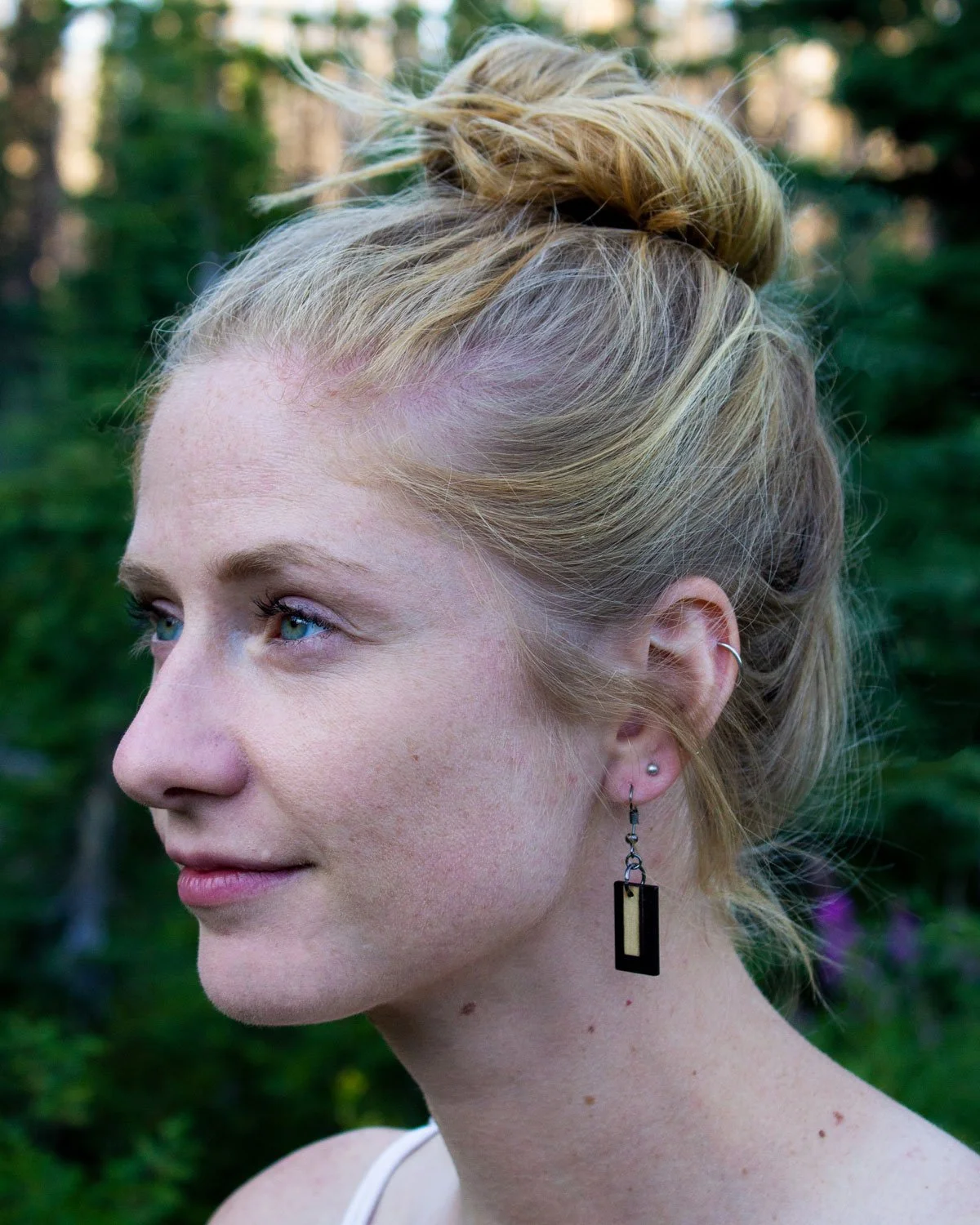
The brand’s lifestyle photography is directed at a predominantly female audience with a passion for conservation and trusted outdoor fashion brands. Models are shown having positive experiences in nature, and take pride in knowing their choice to wear Layer One jewelry is environmentally responsible.
Backing Card & Packaging
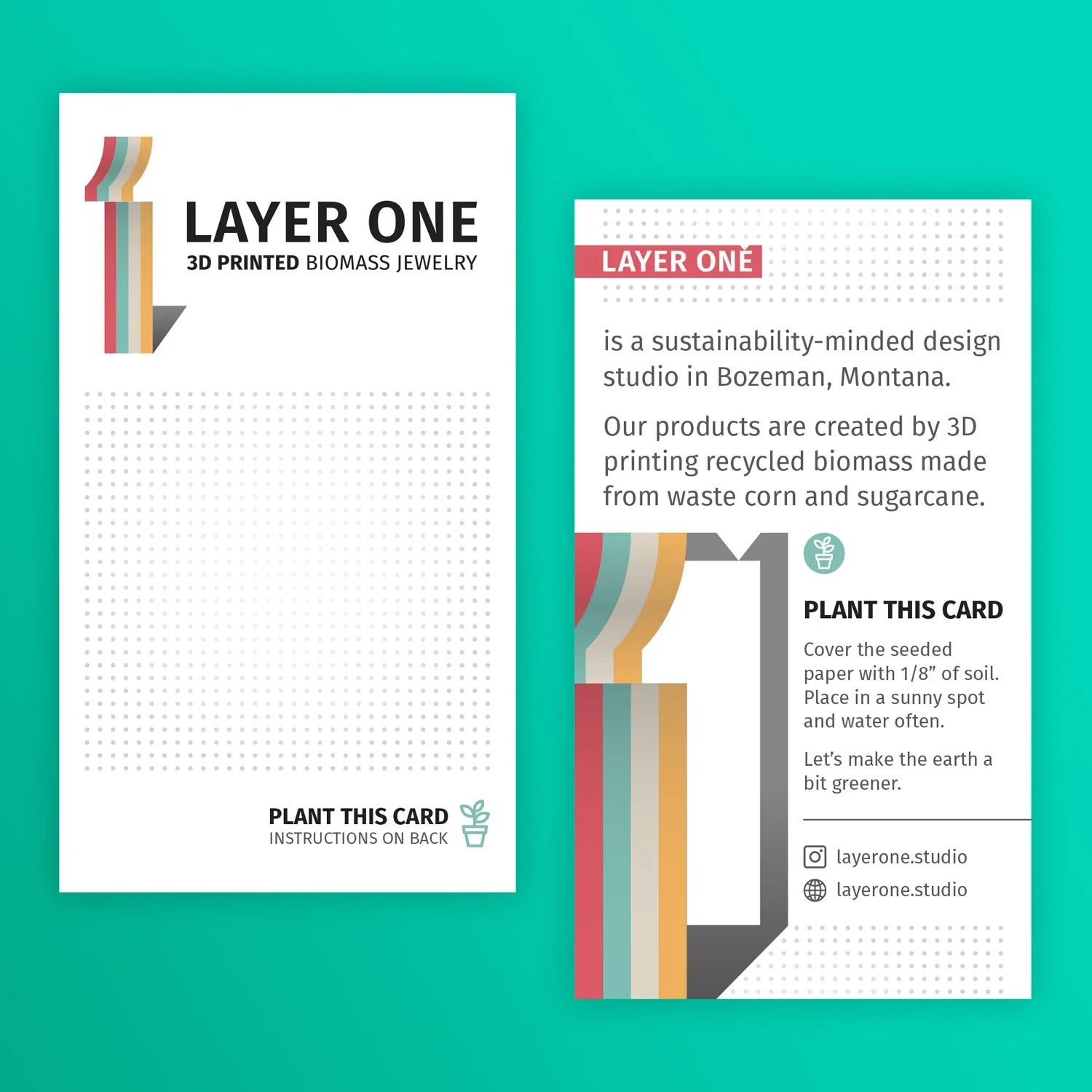
Whether displayed in store or purchased online, each piece of Layer One jewelry is attached to a backing card made of plantable seed paper. The backing card, as well as the recyclable bubble wrap, completes the sustainable start-to-finish process of wearing Layer One products; in addition to the jewelry itself being made of recycled corn and sugarcane biomass, the backing card can be planted and watered in soil like normal seeds to grow wildflowers.
Social
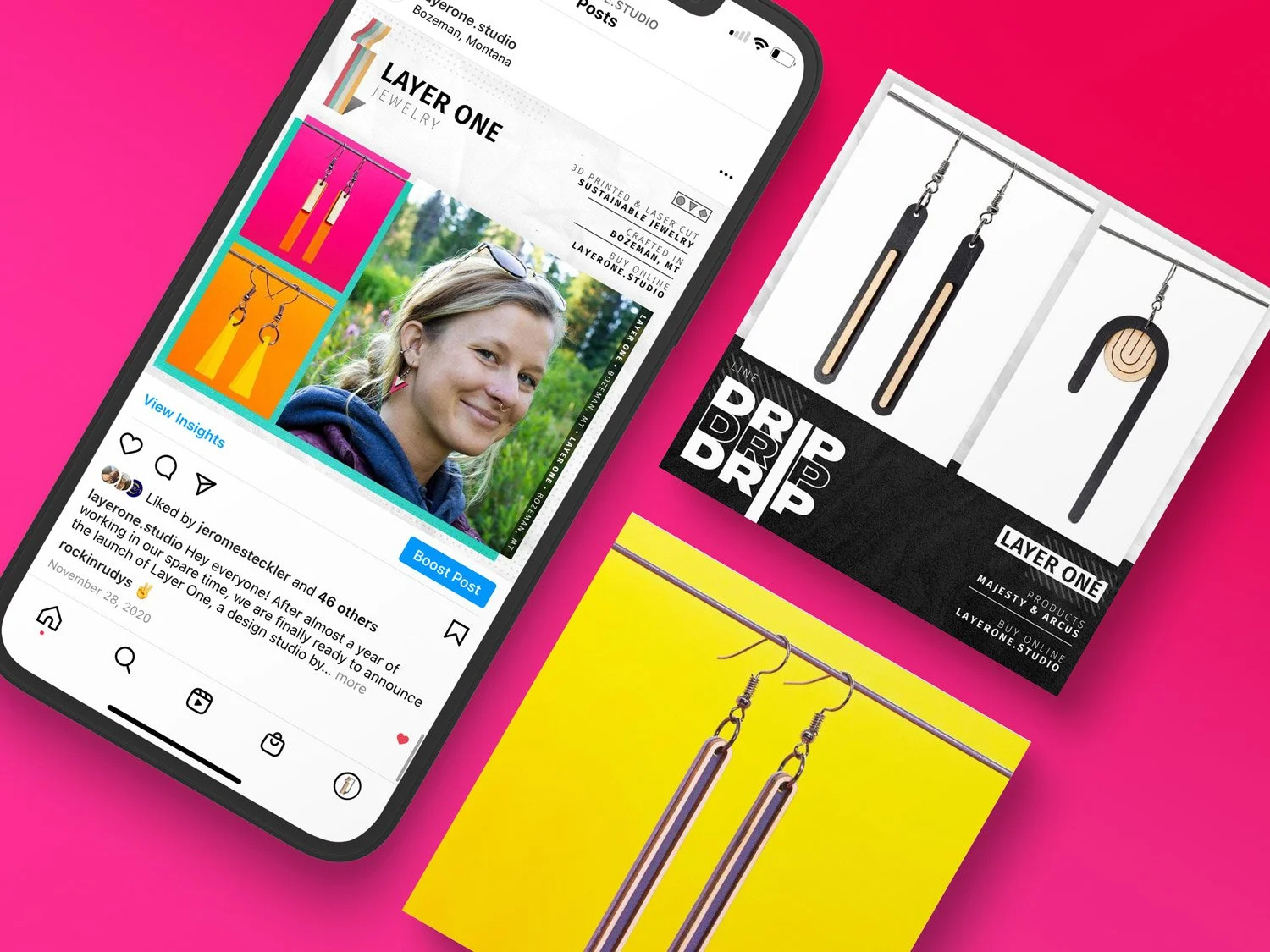
Layer One’s social media pages served as a nucleus for all news relating to the brand; it featured new releases and colorways, sales and promotions, and buyers showing off their jewelry. The social posts took design cues from the rest of the brand’s collateral – bright colors, simple geometric patterns, and outdoors photography – and primarily served as a means to drive traffic to the Layer One website and to jewelry stores across Montana.


